6 political design trends that defined the chaos of 2025
The year 2025 was one in which political and government design broke through to the mainstream. That’s thanks in large part to the new U.S. president, who fancies himself something of a designer-in-ch...
The year 2025 was one in which political and government design broke through to the mainstream. That’s thanks in large part to the new U.S. president, who fancies himself something of a designer-in-chief. “I consider myself an important designer,” President Donald Trump said an October White House dinner to raise money for his planned ballroom.
Of outside designers, he said, “boy, the things they can recommend are horrible.” That doesn’t mean political design in 2025 was all Trump. Though his administration and allies used design to help push his agenda, protesters, politicians, and other political actors also developed a new visual language this year for a new political era.
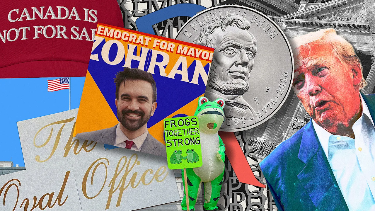
Here are six defining political design trends of 2025. [Source Photo: Jackpine Dynamic Branding] 1. Nationalism is on the rise, and worn on the sleeve Trump took office promising to expand U.S. territory, and that sentiment showed up early this year in merchandise . Trump’s campaign store sold a $43 mock-up of his “Gulf of America Day, 2025” executive order while his joint fundraising committees sold “Gulf of America!” and “Make Greenland Great Again” tees. [Image: courtesy Dada Projects] Up north, Canadians responded to Trump’s trade war and threats to make the country a 51st state with national pride of their own.
The premier of Ontario wore a “Canada Is Not for Sale” hat and Canada’s new Prime Minister Mark Carney leaned into patriotism for the visual identity and messaging of his winning 2025 campaign.
Trump’s tariffs have also inspired a new generation of nation-of-origin “Made In” labels from Canada and Denmark . 2. Trump anti-design is now MAGA McBling Trump’s second-term administration brand is more intentional and designed to look more distinct. Trump updated his official portrait for his second term not once , but twice . (The newest iteration doesn’t use a U.S. flag in the backdrop, as is standard for public official portraits.) [Illustration: FC] His administration also changed its typefaces.
Merriweather , the serif font of his first term that the January 6 committee used during its investigation into the 2021 attack on the U.S.
Capitol, is out. Instrument , a tall, open-source serif that’s on-trend among tech and consumer brands that use the font to look modern yet retro, is in. One of its designers, Jordan Egstad, told Bloomberg , “Using a freely available and open-source font to promote exclusionary policies is deeply ironic.” The administration’s brand was most memorably executed in the high-low staging of his speech at the McDonald’s Impact Summit in November.
The slogan “The Golden Age” appeared in large, yellow Instrument Serif type at the top of a blue backdrop which was placed directly behind the president.
The backdrop also featured a repeat pattern of yellow McDonald’s arches. The ultimate visual effect was a brand mash-up created by combining the official serif of the state with the logo of a giant multinational corporation—and it put our McBling era reality star president very much in his element. [Source Images: Mathias Weil/Adobe Stock, Saul Loeb/AFP/Getty Images] At the White House, Trump has also used a script font common on wedding invitations (which could in theory read as “fancy ” to the untrained eye ) to label the exterior facade of the Oval Office and “The Presidential Walk of Fame,” a presidential portrait exhibit designed as partisan ragebait . 3.
Serifs are in—simply because they’ve become another political pawn While there’s no such thing as a Republican font —even Trump’s campaign logos used sans-serif typefaces —Trump’s administration seems somewhat partial to serif typefaces, or fonts with the small feet on their letterforms. [Illustration: FC] The State Department said this month it was switching fonts to the serif Times New Roman, a typeface developed for print newspapers that it previously used, rather than Calibri, a typeface developed for digital screen reading.
Calibri was made State’s default font during then-President Joe Biden’s administration because it’s easier to read, but Secretary of State Marco Rubio characterized it as wasteful and like a diversity initiative, turning typography into yet another battle in the culture wars. 4.
Government design gets a new focal point: the President Trump is working to put his stamp on government literally by having his name and likeness installed on buildings, which may be illegal . Lettering with Trump’s name has already gone up at the U.S. Institute of Peace and Kennedy Center for the Performing Arts . [Photos: Alex Kent/Bloomberg/Getty Images, Mehmet Eser/Middle East Images/AFP/Getty Images, Harold Mendoza/ Unsplash ] Trump’s image also appeared on the facades of multiple federal buildings , including the department of Labor, Department of Agriculture, and Health and Human Services, at a reported taxpayer cost of $50,000.
His face is also on annual passes for the National Park Service (NPS) , which experienced budget cuts under his administration.
And though he opposed legislation signed into law by former President Joe Biden that funded an Amtrak project in Washington state, Trump’s name went up on signage at the work site anyway. [Source Images: Mathias Weil/Adobe Stock, Saul Loeb/AFP/Getty Images] Even though U.S. law prohibits a president from appearing on U.S. currency until two years after their death, Trump allies are also pushing to put his face on a coin next year , and some believe there’s a loophole.
The new National Design Studio (NDS) headed by Airbnb cofounder Joe Gebbia has also worked on projects like “Trump Card” immigration visas and “Trump Accounts,” or tax-deferred savings accounts for kids. 5.
Protesters adopt a more urgent, and diffuse, design language Trump’s second term lacked a big opening protest a la the 2017 Women’s March, but demonstrations against Trump and his administration in 2025 soon developed their own visual language.
Early protests focused their criticism on Elon Musk after Trump tasked him with running the short-lived DOGE , while No Kings protests brought the Revolutionary War aesthetic to the left after being popular on the right since the Obama-era Tea Party. [Photo: Mathieu Lewis-Rolland/Getty Images] In Portland, protesters dressed up in inflatable animal costumes to play up the nonviolent nature of their demonstrations while in Boston, protesters used historic buildings to project vintage type to tie their protest against Trump to American history .
For the first Sun Day , a day of climate action in September, the designers of the logo left it half unfinished so participants can engage in the act of finishing it themselves. In 2025, pussyhats and “protest is the new brunch” signs feel like ancient history, and protesters have turned to more urgent messages to stand against Trump’s expansion of presidential power. Protest signs at some Tesla dealerships before Musk left DOGE used the image of him saluting at Trump’s inauguration against him, and “No Kings” protests challenged opposition to the administration into some of the largest single-day protests in U.S. history with a logo of a crown with an X through it .
Brunch can wait. 6.
Zohran signals a new era of Democratic design: colorfully optimistic Not since Alexandria Ocasio-Cortez’s 2018 campaign for a New York U.S. House seat has a political brand captured the public imagination like New York City Mayor-elect Zohran Mamdani’s. [Images: Zohran for NYC] The ubiquitous “Zohran for New York” logo and visual identity didn’t use any blue, the standard color in Democratic Party design , and the quirky letterform of its bespoke typography matched the warm tone of his in-person moments and social video strategy .
Hand-drawn by designer Aneesh Bhoopathy and inspired by lettering from city signage and Bollywood movie posters, the logo felt authentic and New York, and it captured the excitement of Mamdani’s come-from-behind campaign .
This wasn’t a campaign designed to look like politics as usual, and Mamdani used type creatively to reinforce his campaign message , like “freeze the rent.” Former New York Governor Andrew Cuomo responded to Mamdani’s surprise Democratic primary win by rebranding to a logo and message that emphasized his experience , but New Yorkers who recalled his time as governor didn’t want more.
As Democrats look to Election Day 2026, the Mamdani brand and communications strategy is an example of how to campaign in a new landscape in part shaped by the biggest political design trends of 2025.
Tags
Continue Reading on Source
This article was originally published on Fast Company. Click below to read the complete story with full details, images, and analysis.
Read Full Article on Fast Company
